Saturday 30 June 2012

Tinkering with Textures

Making the mock croc effect card for Sunday Stampers this week got me into messing about with texture and effects.  To begin with, I mentioned Badger Balm;  Badger Balm comes in several varieties (in cute little tins).  I'm a fan of the muscle rub kind (especially after a brisk quickstep!) and the Love Of My Life swears by the sleep balm.  I pinched his to try out on card and I am liking this result!

On the left is the card (embossed with a Fiskars texture plate called leather, although to me it looks a bit reptile-ish!) and on the right is the same card that I've rubbed Badger Balm into.  It comes out looking like old, soft leather, with a subtle sheen, not glossy...very nice!


A few years ago I came across a technique for making faux leather by brayering dimensional paints onto card.  I wondered if it would work with other media, so I tried it with cheap-as-chips PVA onto coloured card and I am well pleased with the result!
I brayered PVA onto the card making sure the last pass was one-way. I'm going to try this technique with gel medium and add some colour with acrylic paints.

If you're going to try this, don't use your best Speedball brayer though, or if you must, have a bowl of water handy and throw the brayer straight into it when you've done, or it'll end in tears!

Monday 25 June 2012

It was on a Monday Morning...

As in the Flanders and Swann song, It was on a Monday morning  the Gas Man came to call!  .  They've been working on the gas mains in our area lately and it was our turn to have our pipes upgraded and our supply checked out.  So one of us had to stay home from work to ensure that they had access to our premises and that, after texting my deputy and my boss to check  it was OK, was me.

Having an unexpected day's leave, I began work on this week's Sunday Stampers challenge (as set by Hels Sheridan).   This week the topic is Pockets, and here's my interpretation.

I began with a piece of brown card, cut in half lengthways.  I sprayed one half with Ink Refresher and set it aside to dry.  The other half I embossed with to get the crocodile texture (I think it's a Cuttlebug folder) and then inked up with Perfect Medium and heat-embossed with clear detail embossing powder. 

Once I'd cut the plain card into a tag shape and stamped it (the sentiment reads "Your destination is never a place, but rather a new way of looking at things") I cut the pockets out of the mock croc and plain card;  I rubbed over the plain card with Judikins Micro Glaze to get the well-used leather look (I would imagine that Badger Balm would give much the same effect and smell nice as well!) then assembled the tag. 

The ephemera were printed from Tim Holtz's Distressables CD, aged with som Tea Dye Distress ink.
Hope you like it!

Sunday 24 June 2012

Compendium of Curiosities II - Challenge 10

Well, blow me down, I thought I was going to miss this one.  However, I'm not the only person who's had a heavy week in work (the exam went OK, btw) - Linda Ledbetter, who sets the challenges, has had a killer week as well so we've got an extra week. (Whew!).  This week's challenge was to include some Tissue flowers as shown in Sir Tim of Holtz's Compendium of Curiosities, Volume II, and is sponsored by The Funkie Junkie Boutique.

I admit that I have no Tissue Wrap on hand so had to make do with ordinary tissue paper which I stamped with Memento before making the flowers as described in the book, so the results probably would have been better if I'd used the real thing (oh, when will the austerity measures be over?)  I've learned that it is usually false economy to buy the cheap, just-the-same alternative when it comes to Tim Holtz products (buy cheap, buy twice).

Apart from the flower, everything else was left over from a previous project so this was super-quick to put together.  The tag was meant for a Christmas project but wasn't quite the right colour; the leaves were made to go with the batch of rolled roses, the sentiment was one of a sheet downloaded from Pink Petticoat, die cut, then I went with another one on the sheet, and the medallion was a duplicate from another project.  Well, waste not, want not!  I might even use up all the bits in my scraps box ...(Yeah, good luck with that...)

Saturday 23 June 2012

If the balloon goes up...

Well, what with the Diamond Jubilee and the London Olympics, we've all gone a bit bonkers for the old red, white and blue this month!  Now, being Welsh, I would prefer red, white and green, but never let it be said that I refused a challenge.  This is my entry for The Artistic Stamper's June challenge.  The stamps I used are from Tim Holtz and IndigoBlu. I found that Sir Tim's Salty Ocean Distress Ink pad was just the right shade of blue and Festive Berries was the perfect red to match the Union flag I'd printed out - it was almost as if it were planned!

Friday 22 June 2012

Men are from Mars

It's been a hectic week at work.  I've been doing a Change Management course, complete with homework and two exams.  (I passed the first one, but I have to wait for the second to be marked externally before I know the result!)  Anyway, that has meant  I haven't been able to craft as much as I'd like and WOYWW and the Compendium of Curiosities challenge went by the board.

I did manage to pull this together for Hels Sheridan's  Sunday Stampers. The theme this week is MEN, so I decided to base my effort around the glyph for Mars, which is also used to indicate "male" in Biology.


I coloured the tag with Distress inks in red & orange shades (Barn Door, Fired Brick, Spiced Marmalade) with some Brushed Corduroy around the edges and then stamped the swirly gears (from Creative Impressions) in Aged Mahogany. 

I cut a few Gadget Gears from scrap chipboard and painted them with Ferro paints in pewter and silver.  I also Ferro'd one of the clock hands left over from the Stamps Away Pocket Watch that I'd used on another project (since Craft Austerity is still in place - waste not, want not)  then layered them up to make the "Mars/male" symbol. 

Not being the world's greatest at stamping text in a straight line so I deliberately went for a misaligned look with the "Men are from Mars" wording  - that's my story and nobody can prove otherwise!

Sunday 17 June 2012

Never Too Old...

The theme for this month's challenge from Scrapology is VINTAGE. Now,  I have been accused of making "old lady cards" in the past so this is something I am comfortable to attempt.  As today is the last day of my leave (well, technically that was Friday) and I have a pretty challenging time at work on the horizon, and then it's Number 1 son's birthday and there's a family wedding anniversary and the mum-in-law's birthday coming up...it'll be July before we know it, so I'm putting my effort in now.

I'm still on austerity measures, so again I've been using up my stash.  While I was coiling up the Kanban flowers for the pink challenge, I thought I might as well do the whole sheet, so here the flowers are again.  The cameo is shrink plastic, stamped in London Fog Memento and coloured in shades of grey Promarkers, then swiped over with Juniper Adirondack and Forest Moss Distress inks before glazing with Glossy Accents.  The ink blends into the glaze and gives the cameo that soft green colour.   The  sentiment is from Pink Petticoat, cut with a Spellbinders die, coloured with Forest Moss and Juniper;  the lacy medallion die-cut is tinted with Juniper.

For the finishing touches, I added some green velvet ric-rac ribbon, a hatpin and a glass pebble.  I think it came out quite well - I hope you like it!

Friday 15 June 2012

Walk like an Egyptian

My sister-in-law got her degree in Egyptology a couple of years ago. She’s always been fascinated by the Egyptian culture, works part-time in the Egypt Centre at Swansea University, and finally went for her BA, studying part-time. She’s a baker and gets up at stupid o’clock every morning to go to work so it took quite a bit of determination to do it.

Anyway, in her honour, I’ve unearthed this slide mailer and slide that I did some time ago. The stamps are from one of the first stamp sets I ever bought, from All Night Media (are they even still in business?) the paper is from Crafthouse Press, again bought a very long time ago, and the mummy on the cover is moulded in paperclay with an Art Mould.


While I’m away on the banks of the Nile (well, in my dreams anyway) I thought I’d share these pieces of faux ivory, made out of polymer clay (technique here). The soft sheen is the result of some polishing, but mostly it’s down to the use of Klear floor polish (now known as Pledge Multi-Surface Wax), which is useful for all sorts of things as well as floors!

Wednesday 13 June 2012

WOYWW- 13 June

AAARGH!  Domesticity has struck!  On my workdesk today is (dramatic music)

The SEWING MACHINE!


As a matter of fact, I do rather enjoy sewing.  I met the Love of My Life at a Star Trek convention (it's true!)  and I used to love making the costumes for the fancy dress.  (Our Finest Hour was as Doctor Chaotica and Queen Arachnia.)  However, creating a costume for a fun occasion is a different matter from making cushion covers, which is what I was doing.  See, our memory foam mattress topper developed amnesia and had to be replaced;  but there were lots of good bits still  left on it and, as we all know, Crafters Do Not Waste Anything.  So,  after cutting the good bits off and giving them a good wash, I am making some bits into cushions for the car.  (As a matter of fact, the little offcuts are great sponges for applying paint and ink etc;  however, I wouldn't recommend chopping up a good memory foam mattress just  to use in your crafting.)  For more interesting workdesks I would go to Julia Dunnit's blog to find out about WOYWW if I were you. 

Anyhoo,  the Austerity Measures continue.  This is one of Stamps Away's while chipboard shapes covered with some paper that has been in the stash for a loooong time and embellished with some of the rolled paper roses (as seen earlier this week) and some glass pebbles (stuck on with Pinflair glue).  The butterfly was originally yellow but a bit of Sir Tim's Bundled Sage ink soon sorted that out! 
Hope you like. Thanks for visiting!

Monday 11 June 2012

Thinking Pink

This week’s challenge from Hels Sheridan is to make something pink. PINK? Pink? I am decidedly not a pink girl. It’s probably down to my mother’s habit of dressing my sister and me alike, but me in pink and my sister in blue, so as soon as I was allowed to choose, it was anything but pink for me. In fact, the first thing I chose for myself was in a very vivid tartan – and my mother admitted that it suited me better than any other dress I had.
When I was a child, the trend for having everything-for-a-little-girl-in-pink wasn’t as universal as it is these days. I don’t know what happened. I blame Barbie. Whatever the reason, pink has become THE feminine colour.
“But did you know that pink hasn’t always been a colour for girls, or blue for boys?….It started out with boys wearing pink or red because the colours were seen to indicate strength, while girls wore blue because they were “flighty” like the sky. From a 1918 editorial called “Pink or Blue” :
“There has been a great diversity of opinion on the subject, but the generally accepted rule is pink for the boy and blue for the girl. The reason is that pink being a more decided and stronger color is more suitable for the boy; while blue, which is more delicate and dainty, is prettier for the girl.””

So now you know more than you ever wanted.

Anyway, a challenge is a challenge. SOOOOO….


Crafty Austerity measures still in place, so I went digging through the haunted wing of my stash and found my Opalite inkpads, a reflective interference ink. I never really made much use of Opalite; it was one of those products that seemed like a good idea at the time but I never found a use for. However, one of the inkpads was in pink (Crystal Blush) so I hauled it out to play with.

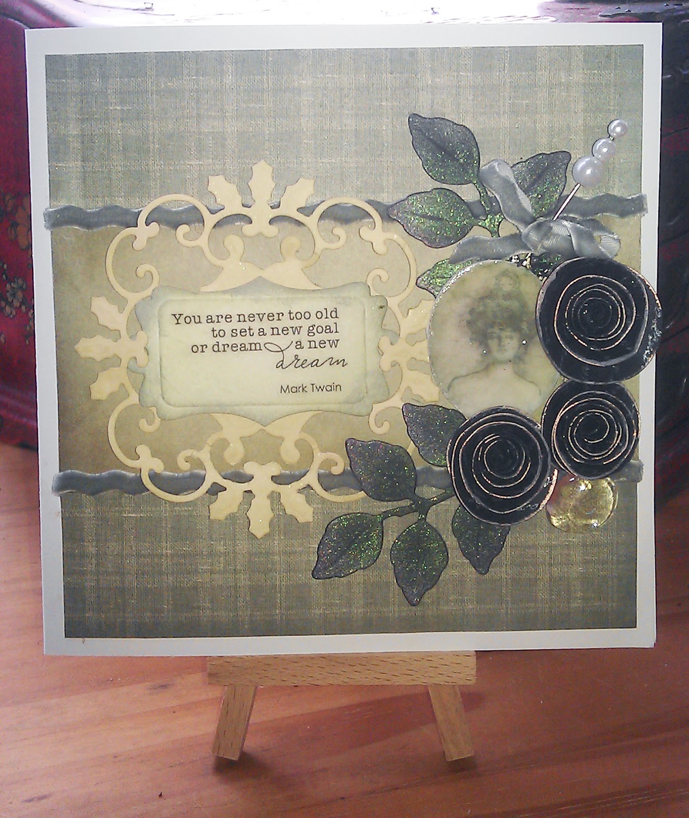
While I was digging, I found some black die-cut coiled flowers, part of a Kanban kit that I’d bought because I liked the Steampunk-y elements. Now, Opalite works best on black so I stamped over them with a script stamp, coiled them up and then pressed the finished item into the ink pad to get a nice pink Opalite edge.

OK, so next I hunted out a Swiss dots embossing folder and embossed a bit of black card. While I had the Vagabond fired up, I die-cut the label shape and also cut some leaves and a small label , after stamping a sentiment– all from dies I’ve had for lo, these many years. (The leaves and small label are from Spellbinders. The label shape is from Go Kreate – I love that they sell dies that are bigger than the ordinary but not as big as the Grand Calibur dies; they fit very nicely into the Vagabond and I don’t have to pay for sizes I can’t use!)

A quick swipe with the Crystal Blush to highlight the dots and to edge the small label and it’s beginning to take shape. The leaves I did in a combination of the Crystal Blush and Cypress Frost. The. sentiment just wasn’t very visible in Opalite so I used silver Brilliance. A little bit of velvet ric-rac ribbon and there you have it. It’s pink – but not as we know it!

Sunday 10 June 2012

Compendium of Curiosities II–Challenge 9

This week Linda Ledbetter has challenged us to make use of the Pocket Watch as set out in Tim Holtz’s Compendium of Curiosities Volume II. Now I’m hoping that this qualifies, as it isn’t a proper Tim Holtz watch - I couldn’t get hold of one, and besides, Crafting Austerity measures are still in place. However, the technique is the same, so here goes…


The heart inside the watch is made from polymer clay using an Art Mould, brushed with mica powder; I added some watch parts and coiled wire for a Steampunk feel. I had hours of harmless amusement coiling wires with a coiling gizmo – it’s most relaxing!

For details of how to join in, visit Linda’s blog; this week Simon Says Stamp are sponsoring the challenge, too!

Wednesday 6 June 2012

WOYWW - 6 June

So here I am, hopping around the bloggerverse again for  Julia's What's on Your Workdesk Wednesday, and as usual I'm in a tearing hurry because I'm out the door again in a bit.  Now you'd think that, with it just having been a four-day weekend,  there'd be something a bit interesting in my Crafting Nook;  but it doesn't work that way, somehow. 

Anyway, here's a picture of Craft Supervisor Mysti, and the only reason she's not on my workdesk is because the printer (which is right next to it) is warmer.


So at the moment,  I'm making the mini album to go into this cute little suitcase, which was made from a pattern from Laura Denison (See Following the Paper Trail) and I'm going to put some of our holiday photos in it. Although our idea of a holday is going and sitting in a haunted house... ("See that speck there?  That's an orb, that is, I'm sure it is!")

See you next week, when (woo-hoo!) I have some time off so with any luck at all I'll have something interesting to show you.

Tuesday 5 June 2012

Compendium Of Curiosities II–week 8

Repurposed packaging?  Ha, this plays right into my hands.  I’ve been repurposing packaging since I was about 8, when I started covering chocolate boxes with pretty paper and keeping my treasures in them (if you’re interested, the treasures were a lace handkerchief, a brocade case for packets of tissues, a large green rhinestone and a ornament in the shape of a cat.)  When I got older I covered boxes in sticky-backed plastic and one that I took to college with me lasted over 20 years – I kept my calligraphy pens in it.
I have a box full of clear acetate packaging, from Sizzix and Spellbinders dies.  The Spellbinders dies are great for Caught in Crystal – being shallow trays, they hold the Klear polish so it doesn’t run all over everything.  Scraps are useful for making it look like butterflies are hovering in mid-air – or an octopus is floating in a Configurations box.  Now.at the moment, I am operating in a state of crafty austerity so the fact that this technique makes use of – well, stuff you normally throw away is fine by me.
This is my interpretation of the technique from Sir Tim of Holtz’s Compendium of Curiosities II;  it’s this week’s task in Linda Ledbetter’s L3 blog, and you should hop on over there to find out more. 

IMAG0228

Monday 4 June 2012

Happy and Glorious…

The Love Of My Life has decreed that austerity measures are in place in our house, due to a very nasty shock when the bank statement turned up last month.  So I am currently in a state of crafty austerity (not allowed to buy ANYTHING unless it’s from Tim Holtz).  It’ll motivate me to dip into my stash, which is Not A Bad Thing.  So for this week’s Sunday Stampers challenge (See Hels Sheridan's blog for details)  I decided to revive the “make do and mend” principles of yesteryear. 

IMAG0221-1

Some time ago Create and Craft did a “buy this, get that free” promotion and this little chipboard house came with another set of chipboard substrates and I’d been looking for a use for them for a while. The Union Flag papers were free downloads from Crafting.co.uk and the bunting stamp was the cover stamp on this month’s Craft Stamper magazine.  The stamped letters were from an alphabet that cost 99p and I coloured the roof, porch roof and window box with Adirondack inkpads, using the  Direct to Paper technique.  Some left over snippets of red acetate behind the windows and ta-daa!  Job done,and at a cost of next to nothing!!